
Ed Stennett
11 March, 2018 • 3 min read
The physics behind it is simple. Colours are the way our brain interprets electromagnetic radiation of a wavelength within the visible spectrum. Visible light lies between 400 and 700 nanometers, and different wavelengths with the spectrum are seen as different colours. And yet, it’s colour that designers have obsessed over for years, perpetually asking how do you chose what colour to use in your design? There is a strong emotional connection we have with different colours, and that connection changes from person to person, and culture to culture. Before deliberating between red or blue, it’s important to take a closer look at the way we perceive colour and how the colour’s we select can eventually be applied to a user interface.

I won’t go into advanced colour theory or the differences between YCbCr and RGB, but instead, take a brief look into what to consider when chosing a palette and how to apply it to your designs. So sit back, relax, and enjoy.
Before we begin, it’s important to understand how we categorise colour. In 1969, Brent Berlin and Paul Kay, two Berkeley researchers, published a book called Basic Color Terms: Their Universality and Evolution. They hypothesised that every culture in history, when developing their language, chose the words for colours in the exact same order. As an example, in the English Language, we have 11 basic colour terms:
Berlin and Kay theorised that if a language had only three words, they would always be black, white, and red. If it had four terms, they would always be black, white, red, and either green or yellow. If it the language had 6 words, they would be black, white, red, green, yellow, and blue. And so it continues. The theory was revolutionary. It completely changed the way we thought about colour and is something designers should consider when developing a palette. To some, green may mean peaceful, health, and growth, and to others they’d simply call the colour green ‘dark’.
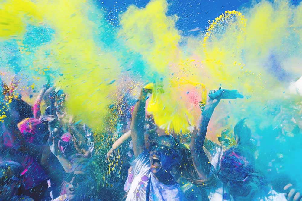
An interesting colour case study revolves around the Tobacco industry. Australian market research company GfK asked 1000 smokers which colour they found the least visually appealing. The winning colour would be used for the packaging alongside new health warnings covering 60% of the pack. The winning colour was Pantone 448 C, otherwise known as opaque couché. When asked what the respondents associated the colour with, the response was ‘death’, ‘dirty’ or ‘tar’ without any positive adjectives. Though Pantone are adamant that “we consider all colours equally” it is nonetheless fascinating the strong emotional connection we have with colour, and the power getting the right tone can have in design. The objective in this case study was to reduce the sales of Tobacco, and so they looked to find a colour that was perceived as ‘ugly’. When next choosing a colour or palette, take a step back and consider what they objective of the design is, remembering that beauty is very much in the eye of the beholder.

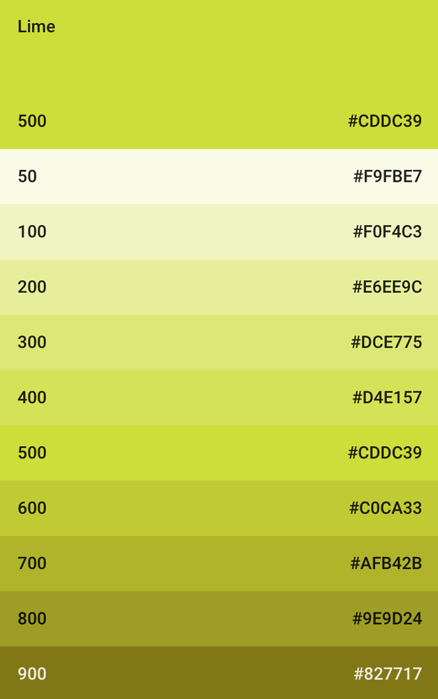
As a UI/UX designer, getting colour correct is imperative. I often refer to the colour theory in Google’s Material Design. The palette starts with a base primary colour and fills in the spectrum to create a complete and usable palette. Google call the base colour the ‘500’. You can then use HSB colour space to make a series of shades with the same hue. To create a lighter colour variation, lower the saturation and increase the brightness. The inverse gives a darker variation.
You can then apply this palette throughout your user interface. The major advantage of this is colour can be very subjective, and using shades of one colour can help take a lot of the user guess work out. As an example, consider a palette that contains blue, green and red. You want to assign one colour for primary and one for secondary buttons, which do you chose? The issue you have is you are making a user guess what the primary action colour is. Making users guess is bad UX. Why not use one theme colour, and the secondary button is simply a lighter shade? A similar technique can be applied to create a neutral, or grey palette for body copy and headings, retaining the hue value, so your greys have a subtle, but effective hue. So often in design, the simplest solution is best. As Antoine de Saint-Exupery famously said:
“A designer knows he has achieved perfection not when there is nothing left to add, but when there is nothing left to take away.”
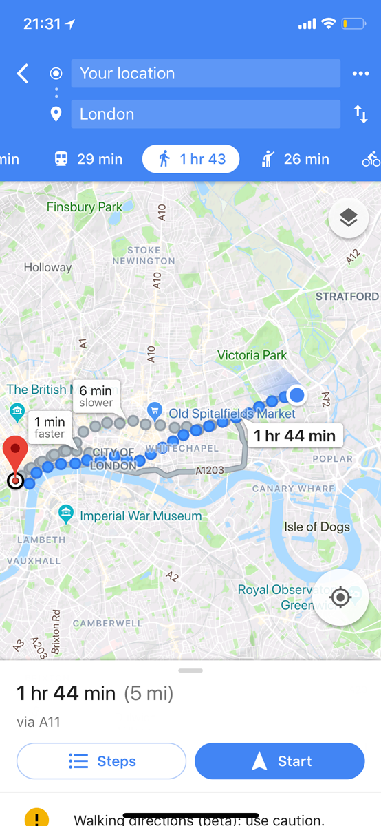
You can see how Google have applied this technique to their Maps app for iOS. Note the different shades of blue used throughout.
There are myriad tools available for designers to help get the perfect palette. A couple I’ve used for projects recently are the Material Color Tool, Adobe Color CC and the colour guide tool within Adobe Illustrator.
In short, it’s important to consider who will see your design and what the colours you chose will mean to them. As we saw with Berlin and Kay, to you, you may see a rich blue, to others they simply see dark. What’s your objective? Do you want to minimise sales like Australian Tobacco, or something different? How are you going to apply your palette to a user interface? How do we ensure users do not guess?
TL;DR, keep it simple. With a strong base colour and a palette of lighter and darker variations, you will be able to do amazing things with just a single colour.
Blog • 10 Jan 19 • 4 min read
As a Product Designer I’m used to shifting pixels, kerning letter forms, and asking users ‘what they expected when they pressed that button’. As a result, words don’t come as naturally to me as others, but I saw a video this week that I felt really captured what we are trying to say at Seenit.
Read moreBlog • 25 May 18 • 3 min read
With data privacy at the forefront of the world's media, I thought I'd write about a topic that is actually a lot easier to do well than people make out: passwords.
Read moreBlog • 22 Feb 18 • 10 min read
Over the next 10 minutes or so, I want to break this down into three common user problems that product teams globally are facing, using examples from the last ~20 years.
Read more