Ed Stennett
11 April, 2018 • 3 min read
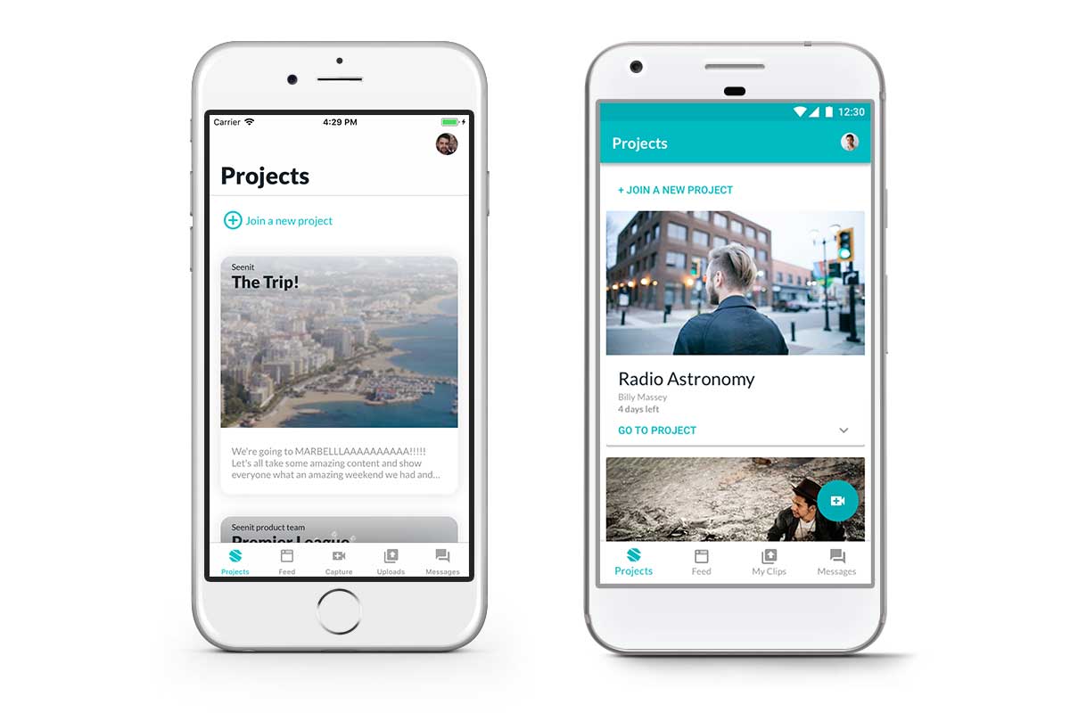
As a product team, it’s all too easy to think of an App as single product. It makes sense to do so, right? Over the past few years at Seenit, a team of product, design, mobile, and engineering people have worked indefatigably to produce a best in class product, available for both Android and iOS. What we wanted to do with Seenit Capture 2.0 was create a clear split between iOS and Android, and thus, treat our App as two very distinct products.
Google’s Android uses Material Design, Apple’s iOS uses Human Interface Guidelines (HIG). The two tech giants have very contrasting schools of thought when it comes to the designs and interactions across their devices and applications.
Material Design, interestingly codenamed ‘ Quantum Paper’, is a design language that has a focus on physical material. In Google’s words:
A material metaphor is the unifying theory of a rationalised space and a system of motion. The material is grounded in tactile reality, inspired by the study of paper and ink, yet technologically advanced and open to imagination and magic.
In contrast, Apple’s Human Interface Guidelines, since iOS 7, has shifted to a ‘flatter’ design style, opting to ditch the skeuomorphic approach we saw in iOS 6 and below. The HIG focuses more on clarity and depth, which is why you see more vibrant colours.
Apple embrace a sense of ‘infinite depth’ throughout HIG and will often use components with background blur in order to create the feeling that the items are floating.
For me, the most important thing to understand is not simply ‘which is better’, but instead to appreciate that your users will, without doubt, use both mobile operating systems, and so as a product team you should always focus on the users and how you can apply Apple’s and Google’s design languages to your two products rather than pick one OS over the other. With that said, let’s take a look at some practical examples.
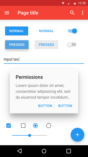
Getting colour correct in user interface design in imperative. A decision was made to use a single, primary, colour to act as the base throughout UI designs. This was because colour can be very subjective, and by using a single colour it can take a lot of the guess work out or what is active and what is not.
In HIG, Apple recommends using colour in a very specific way:
In general, choose a limited colour palette that coordinates with your app logo. Subtle use of colour is a great way to communicate your brand.
Consider choosing a key colour to indicate interactivity throughout your app.
Avoid using the same colour for interactive and non-interactive elements. If interactive and non-interactive elements have the same colour, it’s hard for people to know where to tap.
As a result, we elected to use our primary brand colour throughout Seenit Capture to indicate anything that was interactive. This takes the guess work away for our users, as well as communicating our brand across the App.

With Material design, colour is treated differently. In Google’s words:
Create colour schemes that include darker and lighter variations of your primary and secondary colours.
With that in mind, we took our Primary colour (500) and created lighter and darker variations through the HSB colour space, keeping the hue value consistent throughout. To create a lighter colour variation, lower the saturation and increase the brightness. The inverse gives a darker variation.
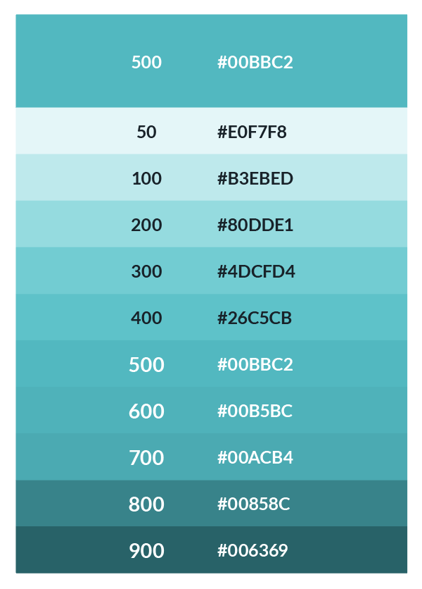
This produced an extensive palette for Android that could be applied to the common material components used throughout the Seenit App. We tended to only use ‘300’, ‘500’, and ‘700’, though it’s nice to have more shades to fall back on as we continue to iterate and improve the App with every new feature we ship.
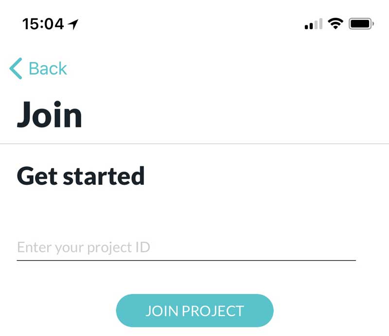
One major difference between iOS and Android is the inclusion of a back button in the latter. The system Back button will be always available on every Android device, either as a physical button or on the screen in the system navigation bar. By default, the back button will close the current screen and take the user to the previous screen. This offers, in my opinion, slightly more freedom when it comes to laying out your App as a user can jump around and easily go back a step.
In iOS, users swipe from left to right* to go back a step or tap the onscreen back button. This means that for iOS, a prominent back button must always be present.
*Note that in Android, the swipe from left to right gesture would switch tabs.
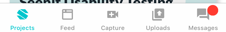
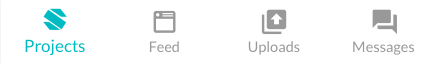
Most Apps will have different areas most commonly organised between tabs. The ways these tabs are implemented is different across iOS and Android.
In iOS, HIG recommends using a tab bar, located at the bottom of the screen, to give users easy access to the top level areas of the App. In general, a tab bar is used to organise information at the app level as a form of navigation.
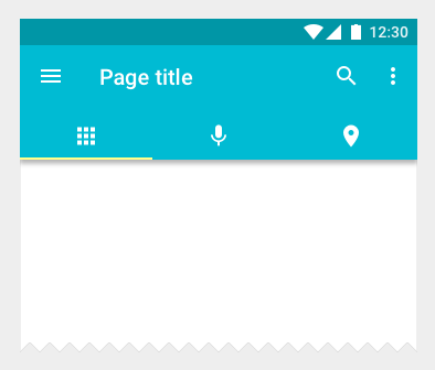
In Android, Google recommends two options for navigation: the top tab bar and the bottom navigation.
The top tab bar tends to be more common on Android as it allows for swiping between tabs and each tab can represent any level of the App’s information hierarchy.
For the Seenit Capture app, we opted to use a bottom navigation bar for number of reasons. The most important reason, for me at least, is that the bottom navigation is located in a more ergonomic location than the top tab bar. When you consider the average size of someones hand in comparison to the size of a phone, it seems to me to make more sense to have a navigation bar on the bottom as that will be easier to reach.
In addition to this, bottom navigation bars should always represent the top level of the app’s information hierarchy. This is the case for the Seenit Capture app.
Material Design uses something called Floating Action Buttons. This a button with an icon that floats on top of the main content. It represents the primary action in an application. We use this in Android throughout the application to allow users to capture content from anywhere inside the App.
It is not best practice to use a FAB in iOS design. Instead, HIG states you should use a button to initiate app-specific actions.
A big learning point from this project has been that you can’t afford to pick between iOS or Android. Everyone will have their preferred mobile OS, but it’s down to you as a designer to put the user first and have faith that the rest will follow.
Google Material Design and Apple’s Human Interface Guidelines provide a fantastic starting point for designing user interfaces, but they should always be used as a guide. Don’t let them limit your creativity, but rather aid it.
In short, it’s been amazing to work on the Seenit Capture App across iOS and Android. We’ve made a concerted effort to follow best practice when it comes to designing for both and we can’t wait to see what you make of the new app. It’s a huge step for us in the right direction and we’ve got a lot of incredible feature ideas in the pipeline which we’re super exited to ship over the next year.
Blog • 5 Mar 18 • 3 min read
Over the last week, I've been lucky enough to work on an enormously exciting rebrand project that gave me an opportunity to get my hands into an area of design I haven't touched for over a year: (re)branding.
Read moreBlog • 10 Jan 19 • 4 min read
As a Product Designer I’m used to shifting pixels, kerning letter forms, and asking users ‘what they expected when they pressed that button’. As a result, words don’t come as naturally to me as others, but I saw a video this week that I felt really captured what we are trying to say at Seenit.
Read moreBlog • 28 Apr 18 • 3 min read
To define is to limit. From Oscar Wilde’s ‘The Picture of Dorian Gray’, the quote explores how when something is given a definition, it is confined to the parameters of the definition itself and limited as a result.
Read more