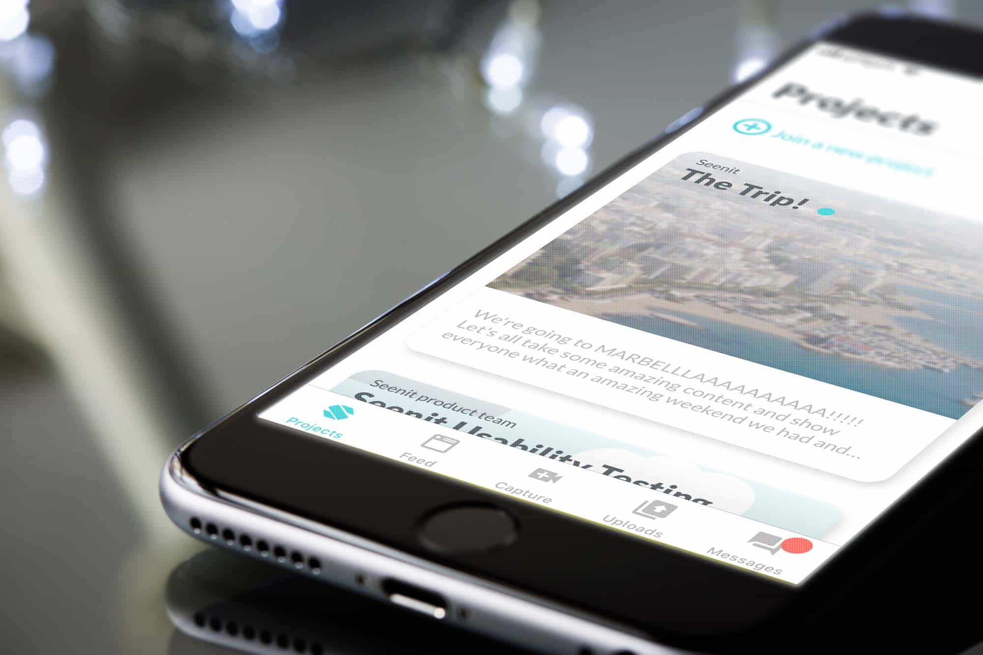
I worked on the update of Seenit’s iOS and Android capture apps. Working in a small product team, we used the Double Diamond design process. I was involved predominately in the user-interface design and product marketing.
As a product team we began by gathering insights and identifying key pain points for users. Our ultimate objective was to ensure we had more users joining more at least 2 projects and contributing to all available shots. The existing app was designed around users joining a single project; we wanted to shift users away from this.
With pain points identified and the initial research carried out, we began to produce some initial low fidelity designs around how we could shift towards a multiple project view. The basic premise was that every part of the app would be global and users could filter by projects they had joined. We conducted several user tests with the low-fi prototype and iterated the design based on feedback and our findings.
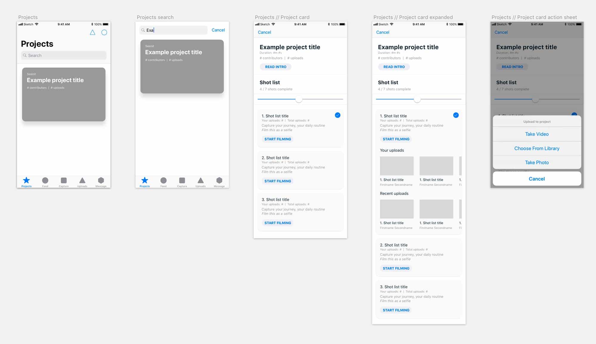
After several rounds of iterations we were at a point where we felt we like we had enough to move onto the next stage.
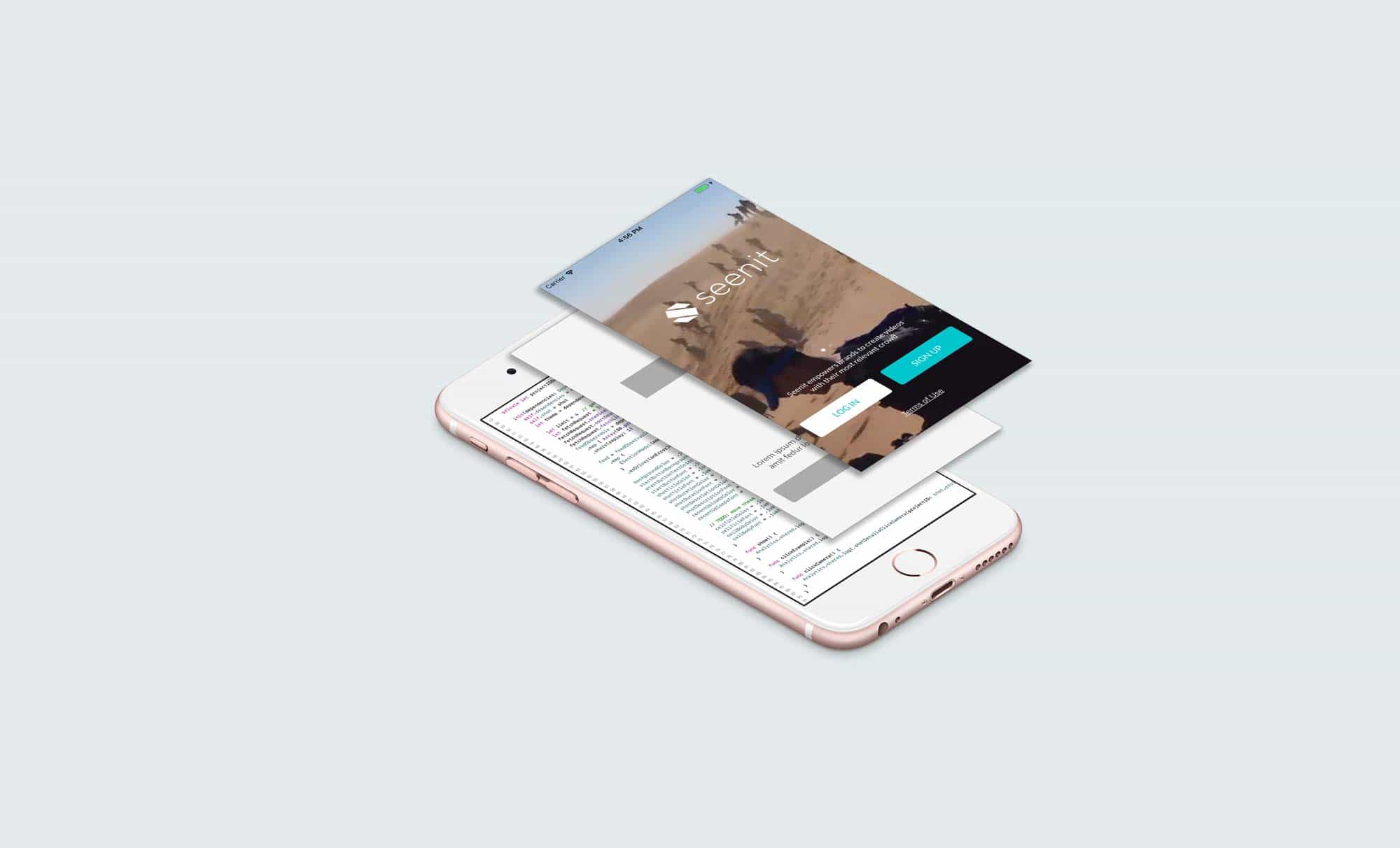
As part of the new app we also wanted to update the user interface with a whole new library of components and a lighter look and feel. Apple’s HIG recommended using one single key colour throughout to indicate interactivity throughout the app. A big focus of mine was to think of Seenit Capture as two different products split between iOS and Android. Throughout the design process, we closely followed HIG and Google’s Material documentation, using common components throughout to offer a familiar user experience. I build an iOS and Android symbols library in Sketch to ensure consistency across design. This was added to Zeplin so that the Engineering team would always have a point of reference. When building these components, I also needed to consider how we themed the products for when we needed a white label version of the app. We used a simple, scalable colour theme that allowed us to very quickly and effectively white label Seenit Capture.
Once the app was ready, we released the app internally for a couple of months to ensure that as a company we were all familiar with the app but also to try to stamp out as many bugs as possible. Once live, we have stuck to fortnightly releases and continue to update and improve the app.
In the build up to the launch of the new Seenit capture app, I worked on two animations that would be used for marketing and training purposes.
We wanted to produce two videos. The first would be for social that we could use to highlight the changes and create a buzz around the new app. The second would be used for training purposes when it came to on-boarding new customers and showing them more detail around how to use the app.
I started with a basic storyboard and the general direction I wanted the video to take. I fired up Illustrator, Sketch, and Xcode and began creating the various assets required. Once I had them ready, it was a simple case of animating everything in After Effects and stitching it all together in Premiere Pro.
I followed a similar process for the 'Using the App Video' as before. The big difference was the inclusion of the voice over which meant getting a script nailed early on in the process so that I could animate to the voice. Once we had the voice over done, I tidied it up in Audition and then brought it into After Effects so that I could animate to the voice. I finally brought everything together in Premiere Pro. The video has been a success and is used in Sales and Training decks.
With the success launch of Seenit Capture 2.0, we wanted to explore how we could improve the flow of uploading content to the app.
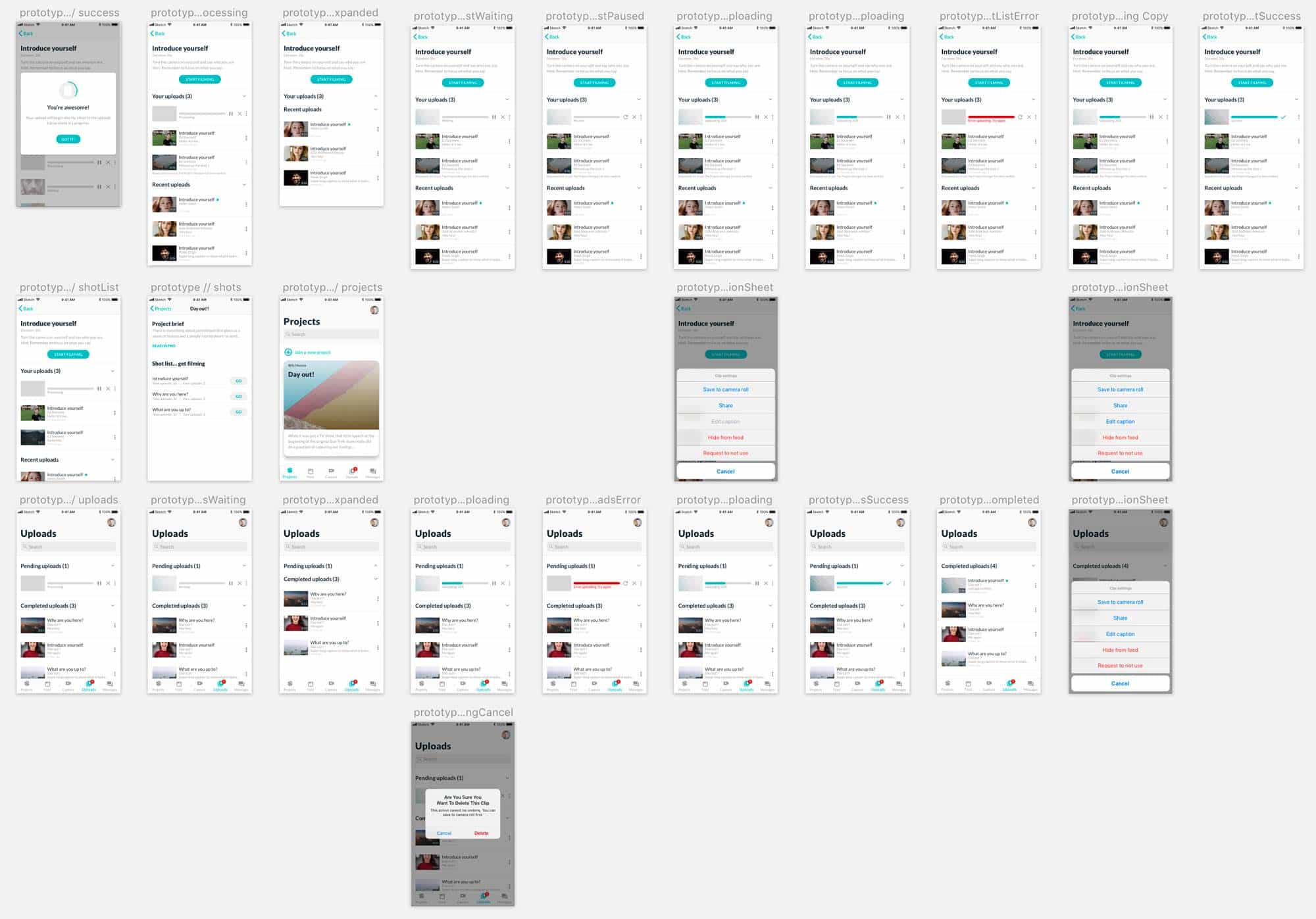
Post launch, I carried out a number of user tests to identify potential pain points for users. A common theme for users was not being certain if their upload had completed and where they could see said content. With a trusty whiteboard and pen, I put together the high level information architecture and from there some basic sketches of the user flow. It became apparent that once content has begun to upload, users should see its progress immediately, as well as being given control over its state (pause, stop, start).
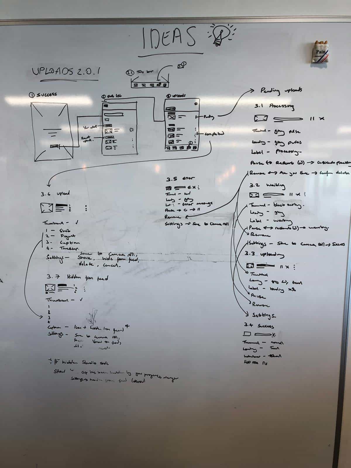
With the IA complete, I worked on a low fidelity prototype for the improved uploads flow. With this, I began some further user tests and iterated the design based on my findings and feedback.
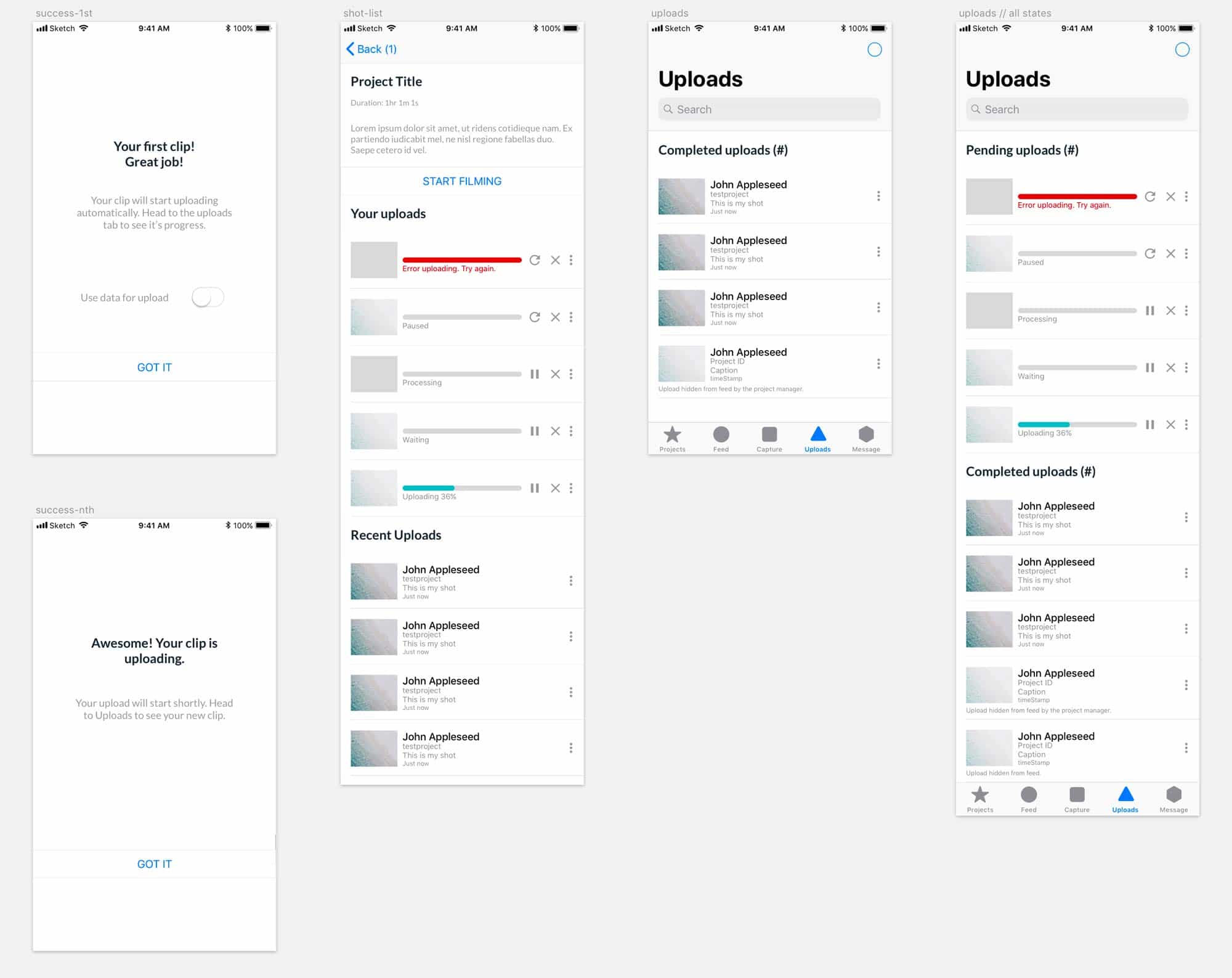
I used the extensive Seenit iOS and Android Sketch symbol libraries to put together polished designs. I made sure to follow best practice, ensuring the familiar iOS and Android components were used to provide the best possible user experience.