I led the Seenit rebrand project that went live in May 2020. I worked with an agency called Symphony Talent to build on the messaging, Floating Elements to help with the logo design and animations, and I worked on the overall visual identity. The launch saw an immediate increase in traffic, MQLs, SQLs, and pipeline. 2020 proved to be our best year ever.
Ever since joining Seenit, I wanted to develop a brand identity for the company. For a project as big as this, it was always bottom of the priority list.
When I joined in August 2017, we had a logo but no clear visual identity or brand framework. One of my first mini projects was to create a basic identity that all teams could refer to. Working in the Product team at the time, we used this heavily for user interface design.
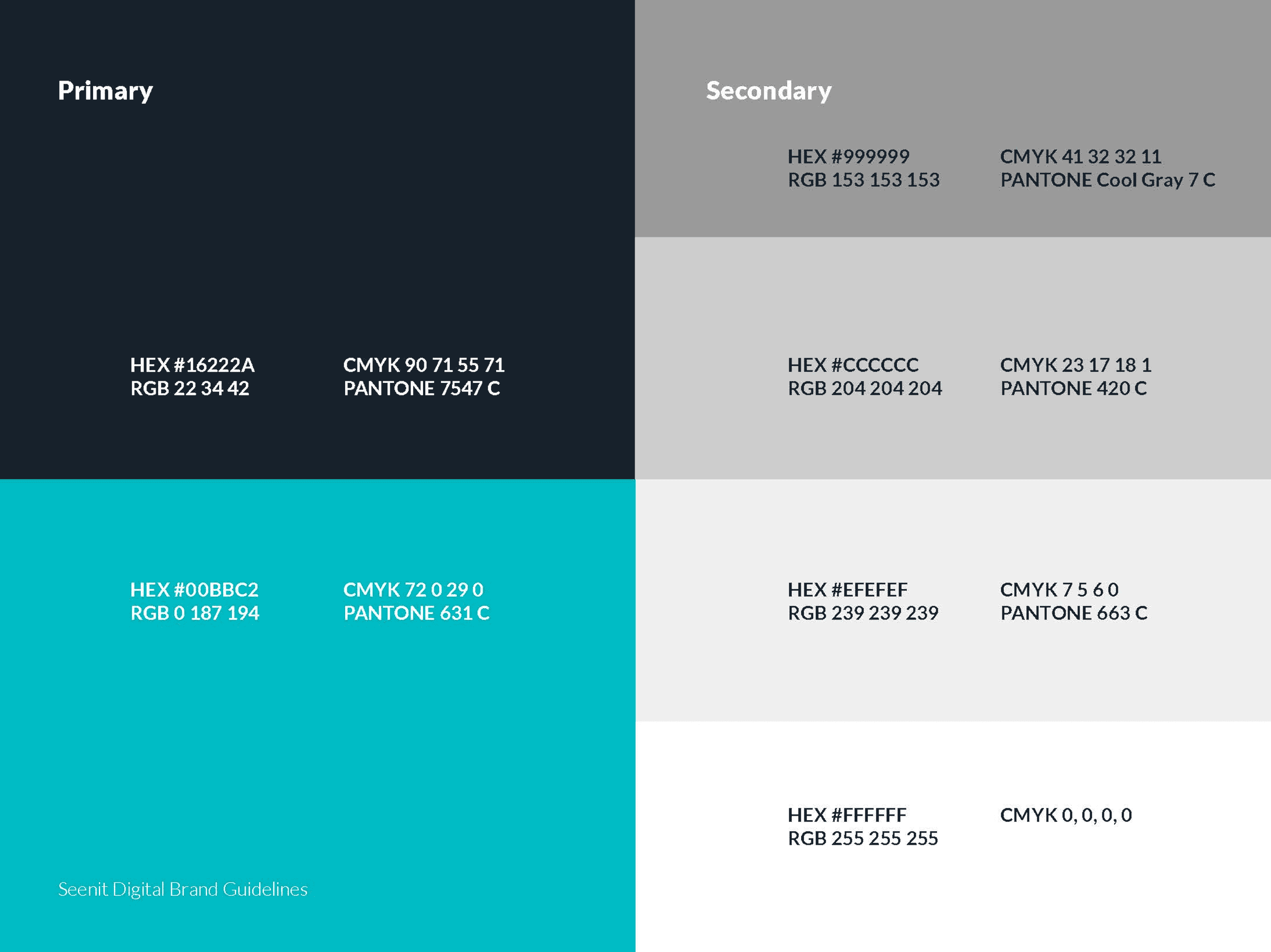
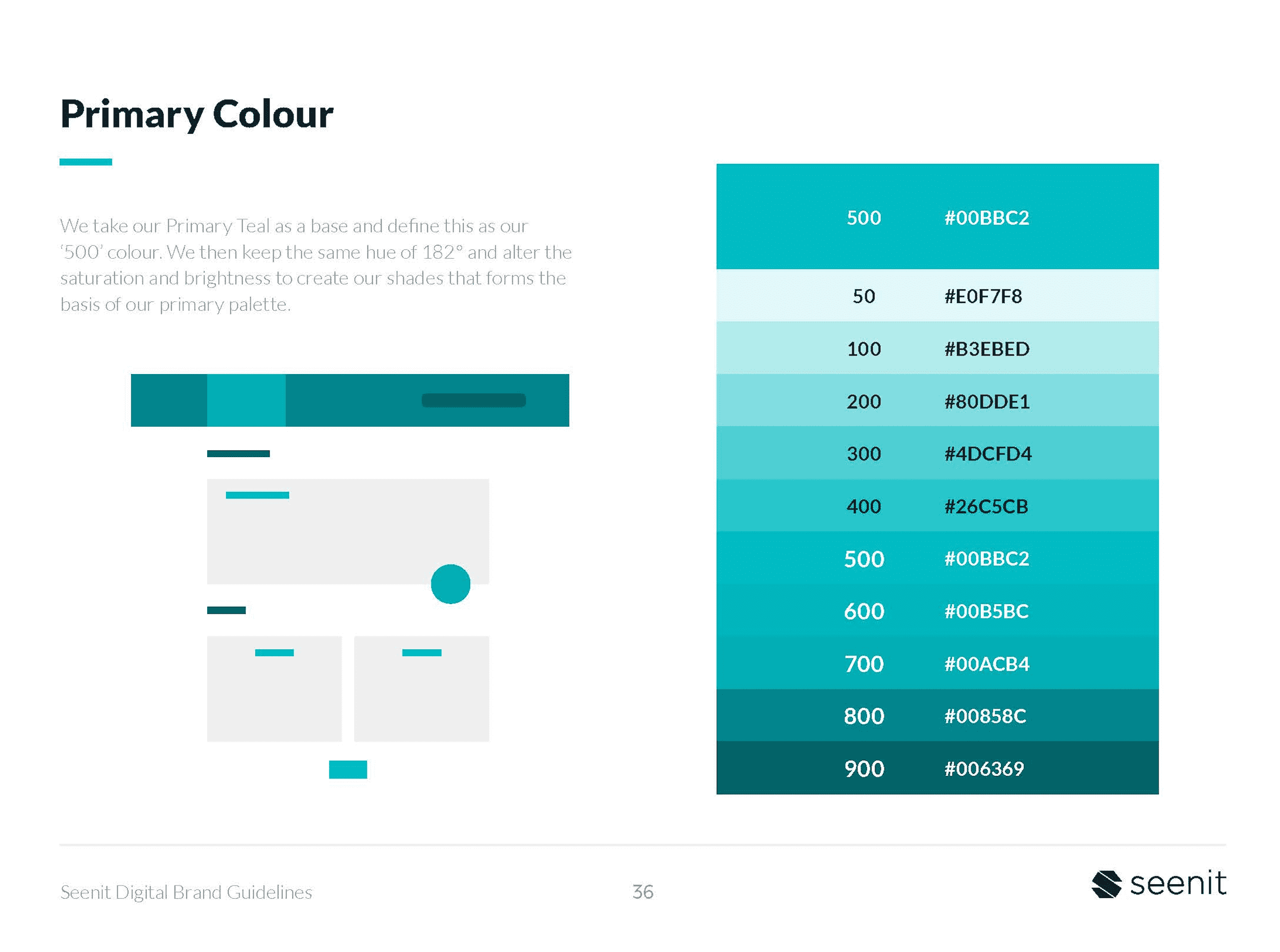
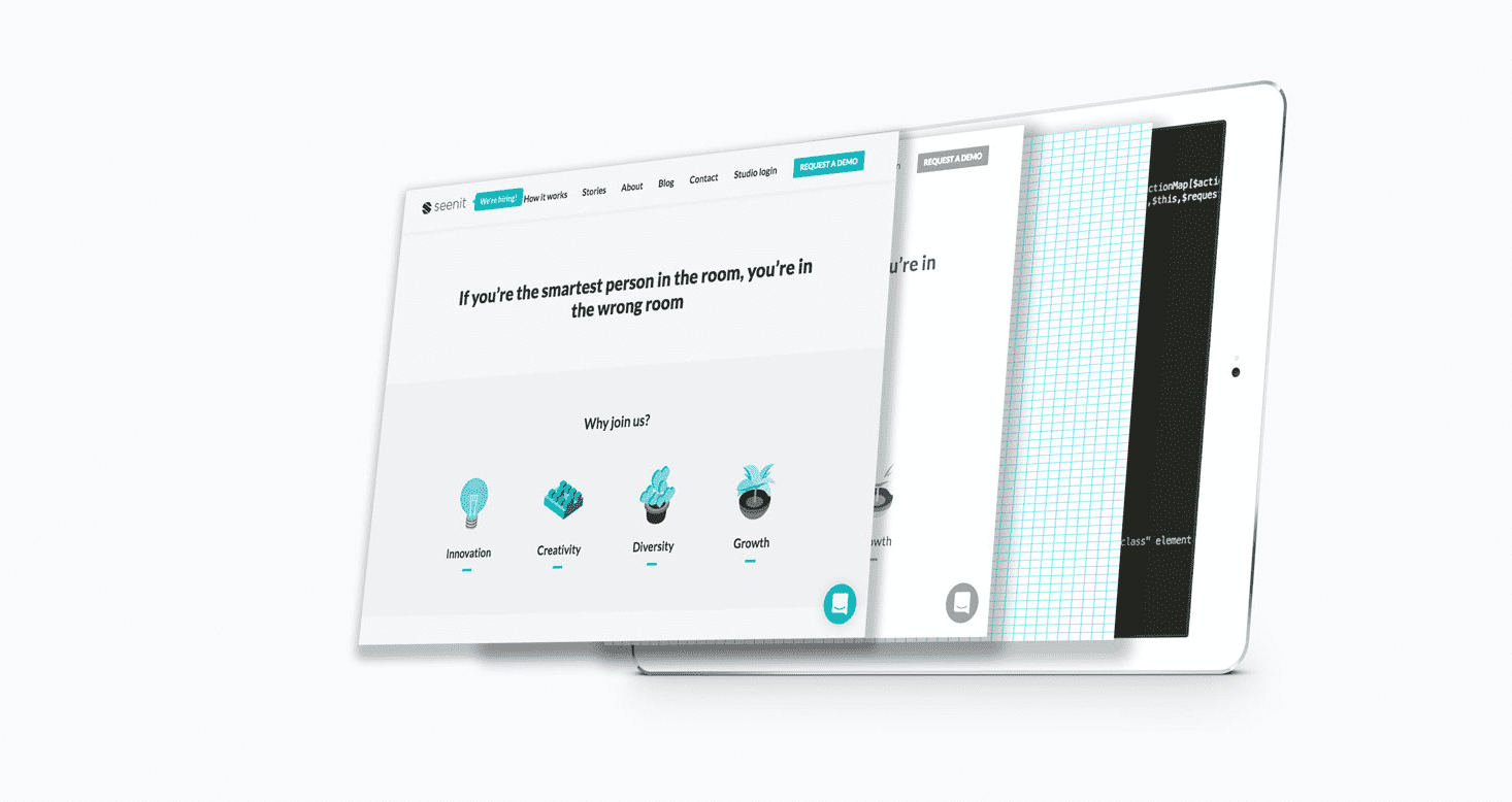
In early in 2020, after months of hard work and graft, the new Seenit identity was unveiled.
We started to talk about the visual identity in 2019. Working with the CEO we began by attempting to nail our company mission, values, and vision.
I’ve learned from experience that when it comes to brand, rather than jumping straight into logos, colours, and layouts, starting with research will make the entire process smoother and yield a better final result.
I wanted to get some external help to do this project justice. I pitched internally to get some additional budget to work with an agency to help with our Brand Positioning. Ultimately, it’s not something we had enough in-house experience to do. Several agencies pitched over a period of two weeks and we ended up working with Symphony Talent.
The first phase involved company wide focus groups, calls with leadership, current customers, and potential customers. Coupled with competitive analysis, a previous insight review, and desk research. The extensive discovery phase gave us an idea of who we were as a company.
We worked closely with Symphony Talent on building a messaging framework.
We worked closely with Symphony Talent to take the discovery report and create a central position and core brand essence that we could use. There was a fair amount of debate during this phase, but eventually we had a brand architecture framework that included:
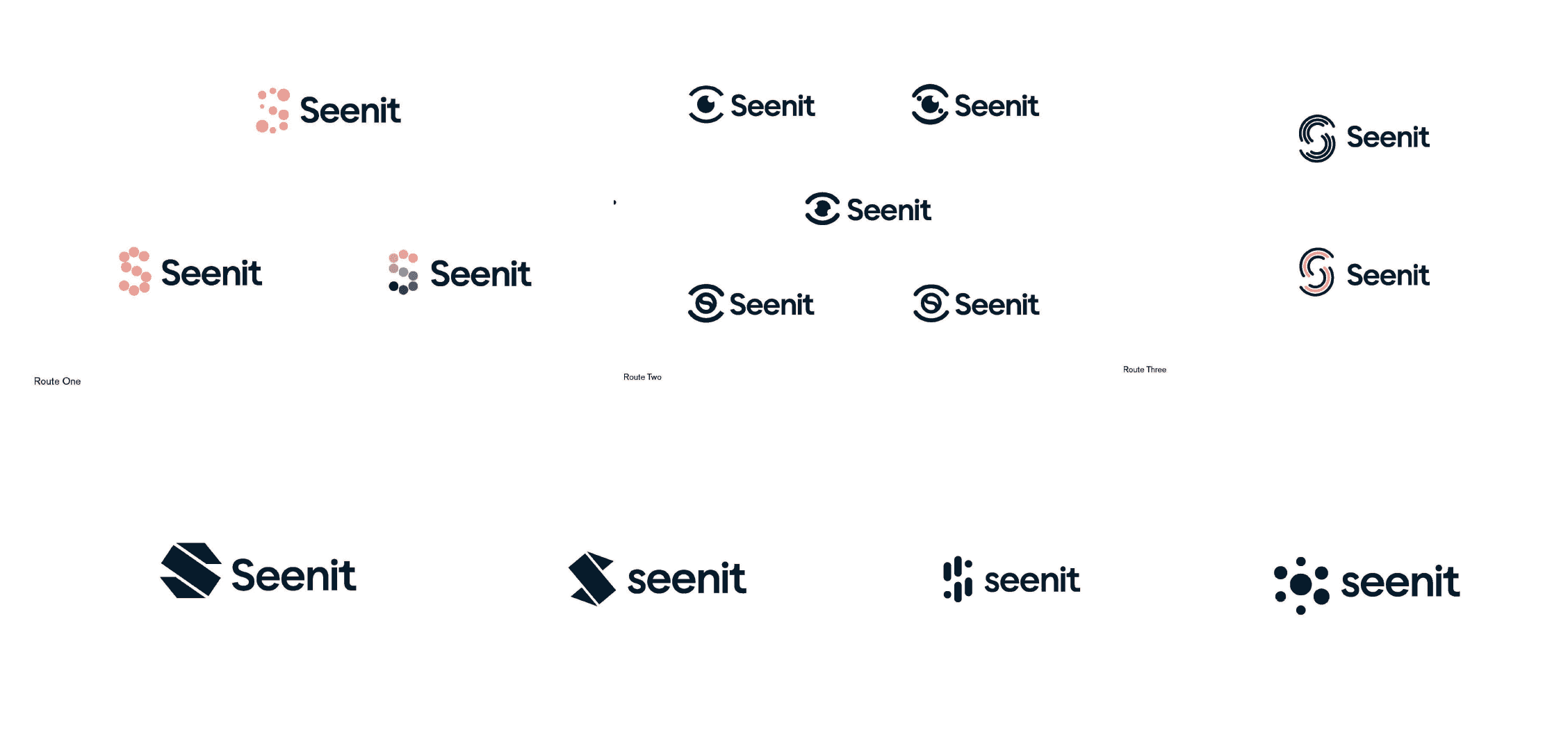
Using the new framework, I got to work doodling. From a range of logo mockups to poster mockups, I printed these out and put them around the office. Working closely with the CEO, we put together a range of designs. Some good, some dreadful, this was the phase I enjoyed the most.
I’ve included a select few mockups below to give an idea of some of the designs I tried.
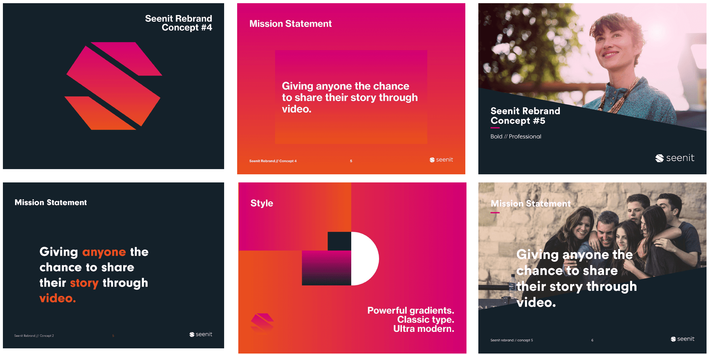
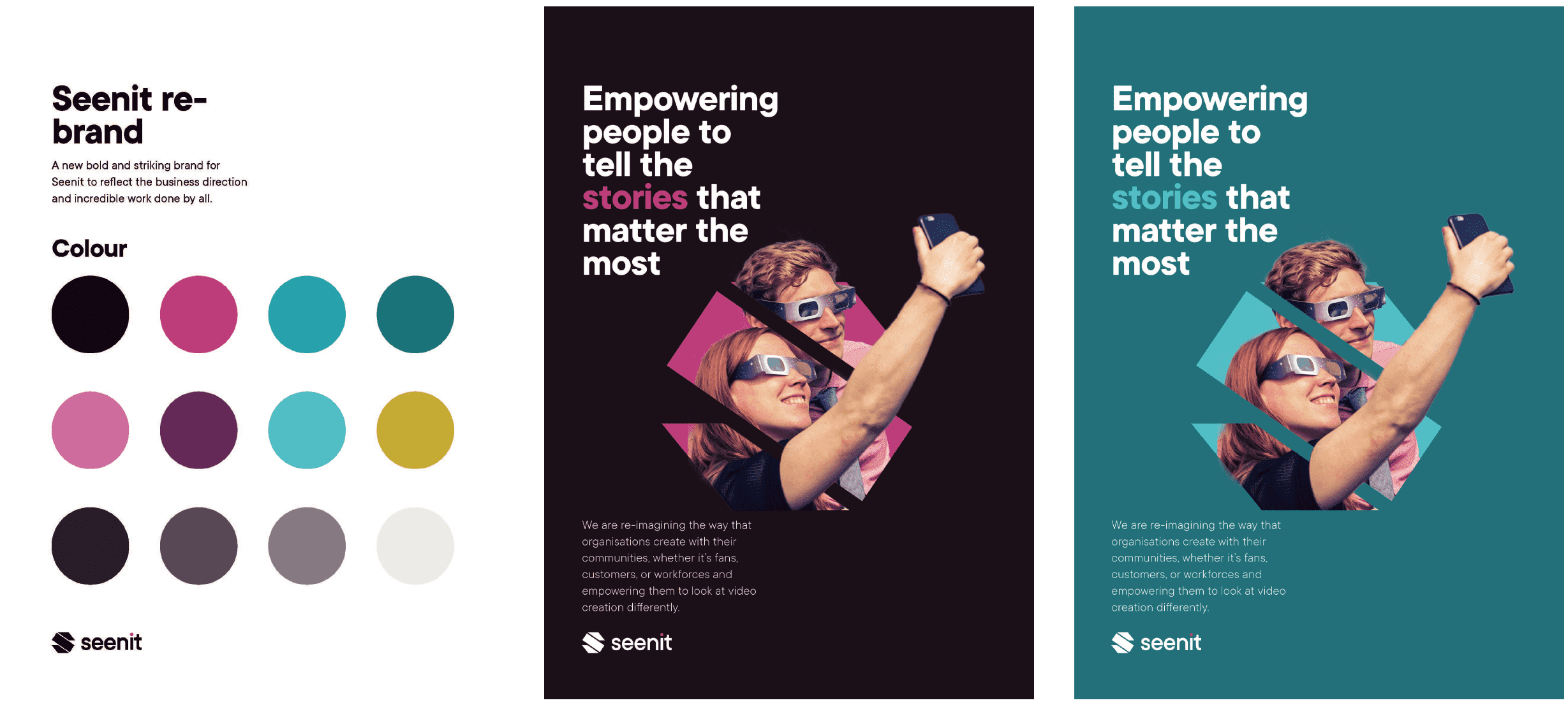
After settling on a logomark, I found during my research a company with a similar mark. I was also made aware of another company that were rebranding with a similar mark. After consulting with our COO, we agreed to go back to drawing board and not run the risk.
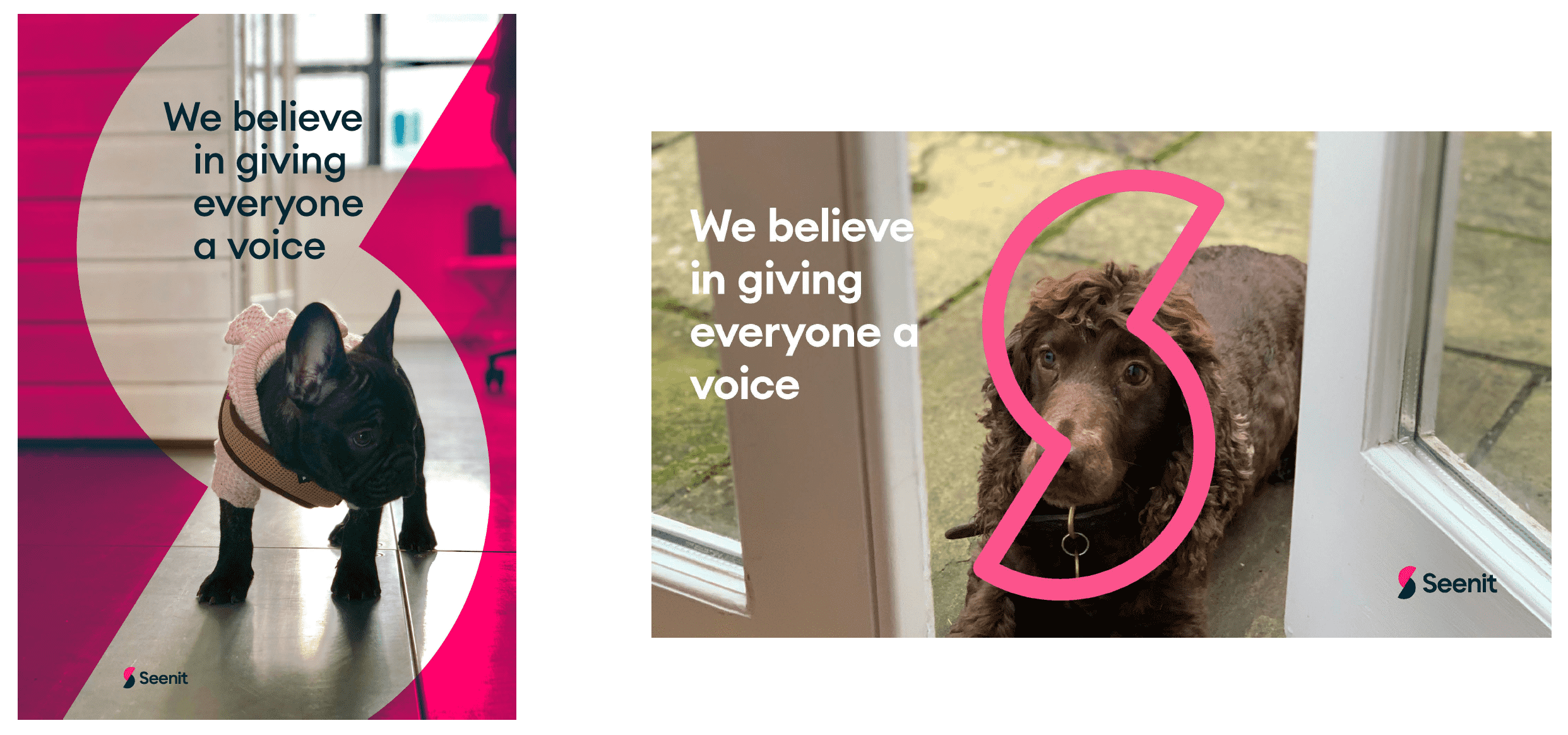
I briefed Floating Elements, an agency I’d used before, to look at developing a new logo and animations. They produced a new logo that felt fresh, simple, and inherently ‘Seenit.’ It was then a case of developing a new design system and a strong, scalable brand identity.


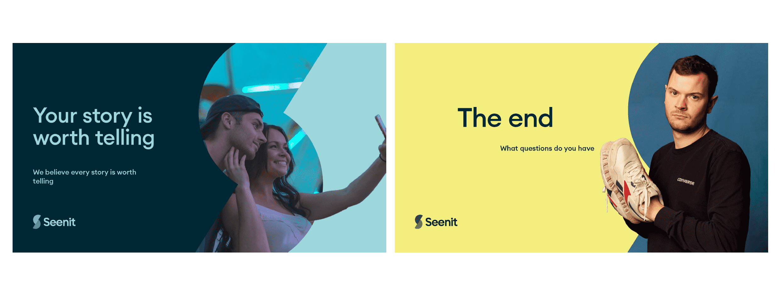
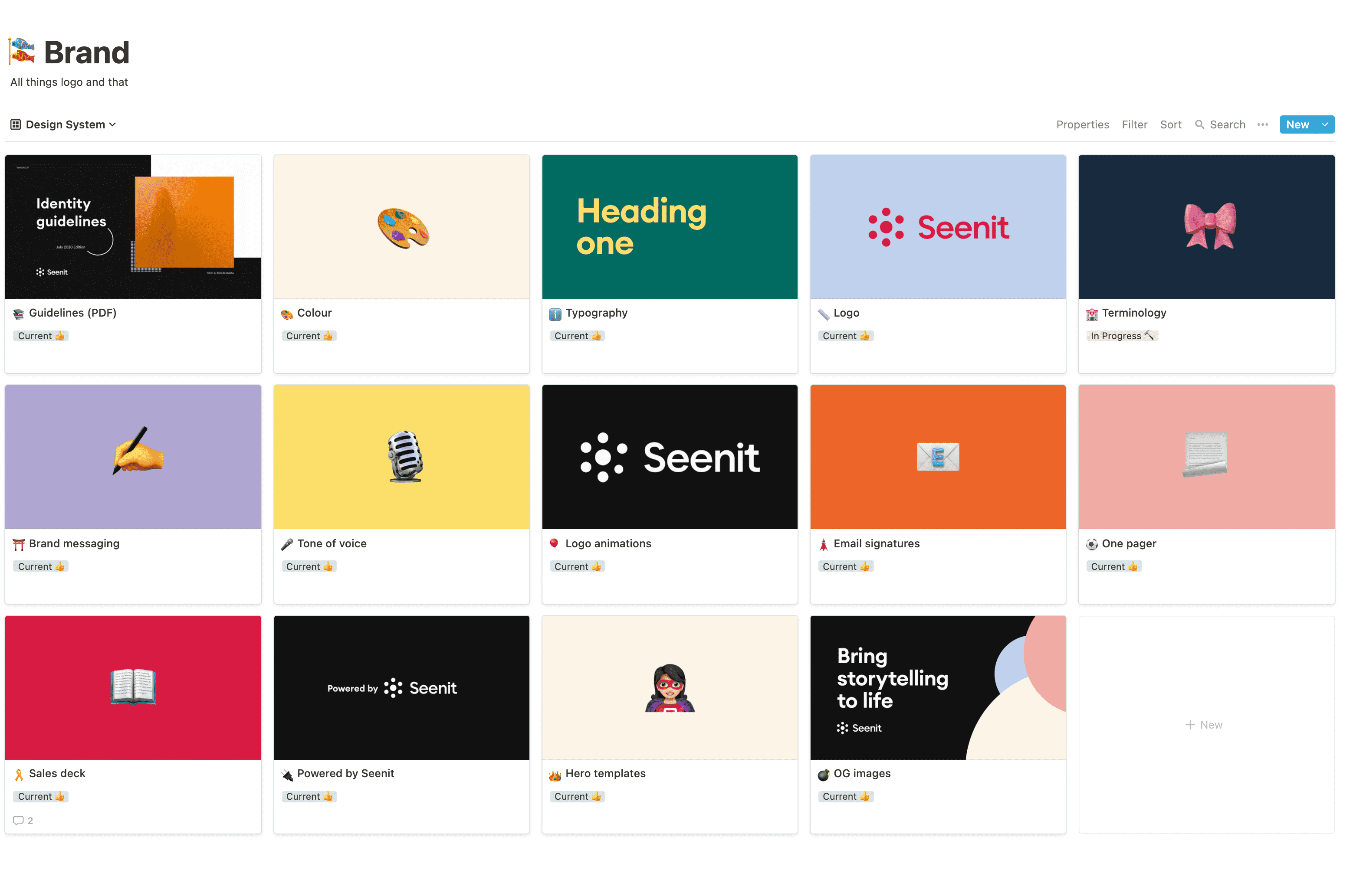
With messaging, a brand framework, and a logo, I developed the visual identity. There were a fair number of revisions, but in the end we had a comprehensive set of brand guidelines and an internal brand centre on Notion. The brand continues to evolve to this day and having everything in Notion allows anyone in Marketing to easily update a page.
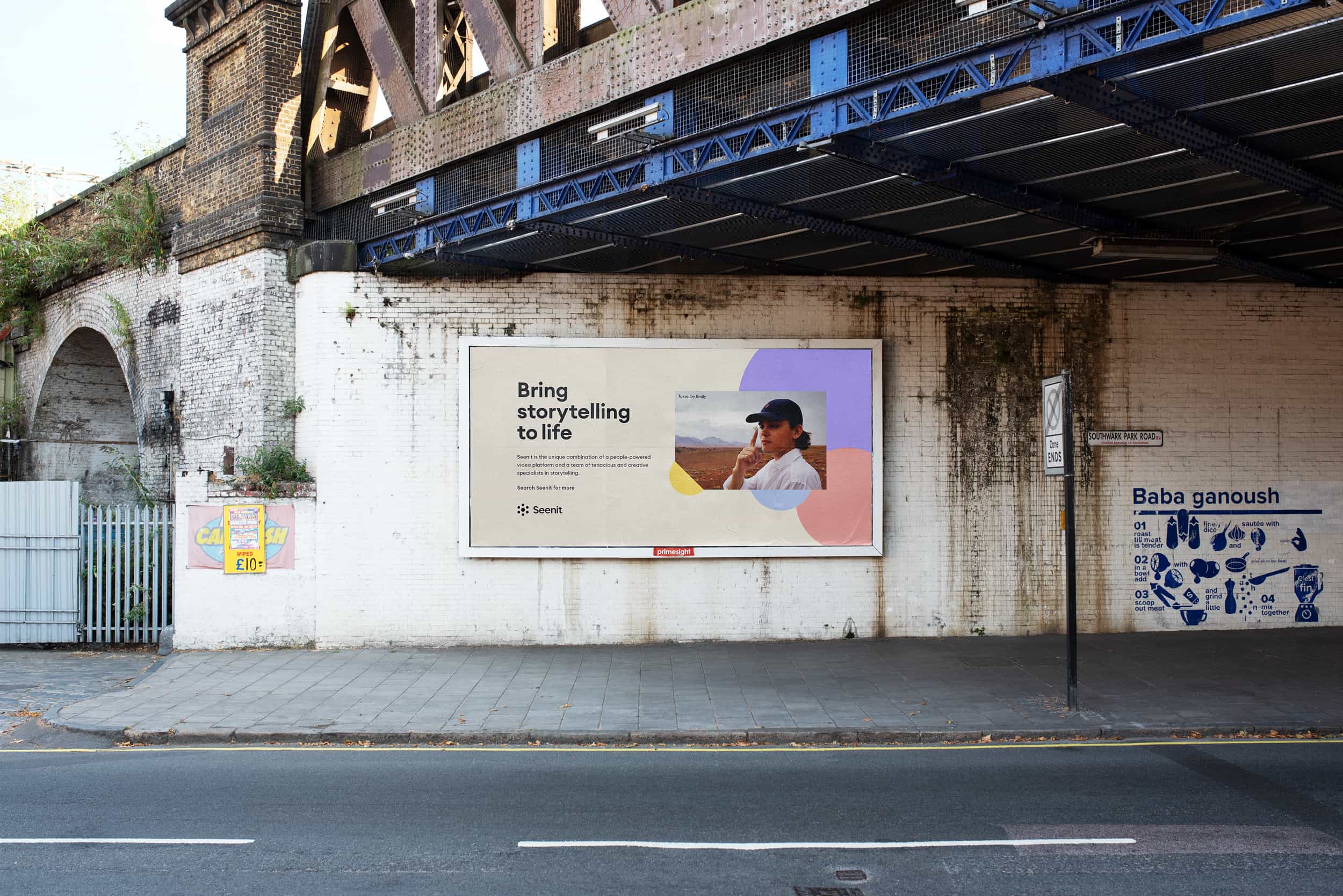
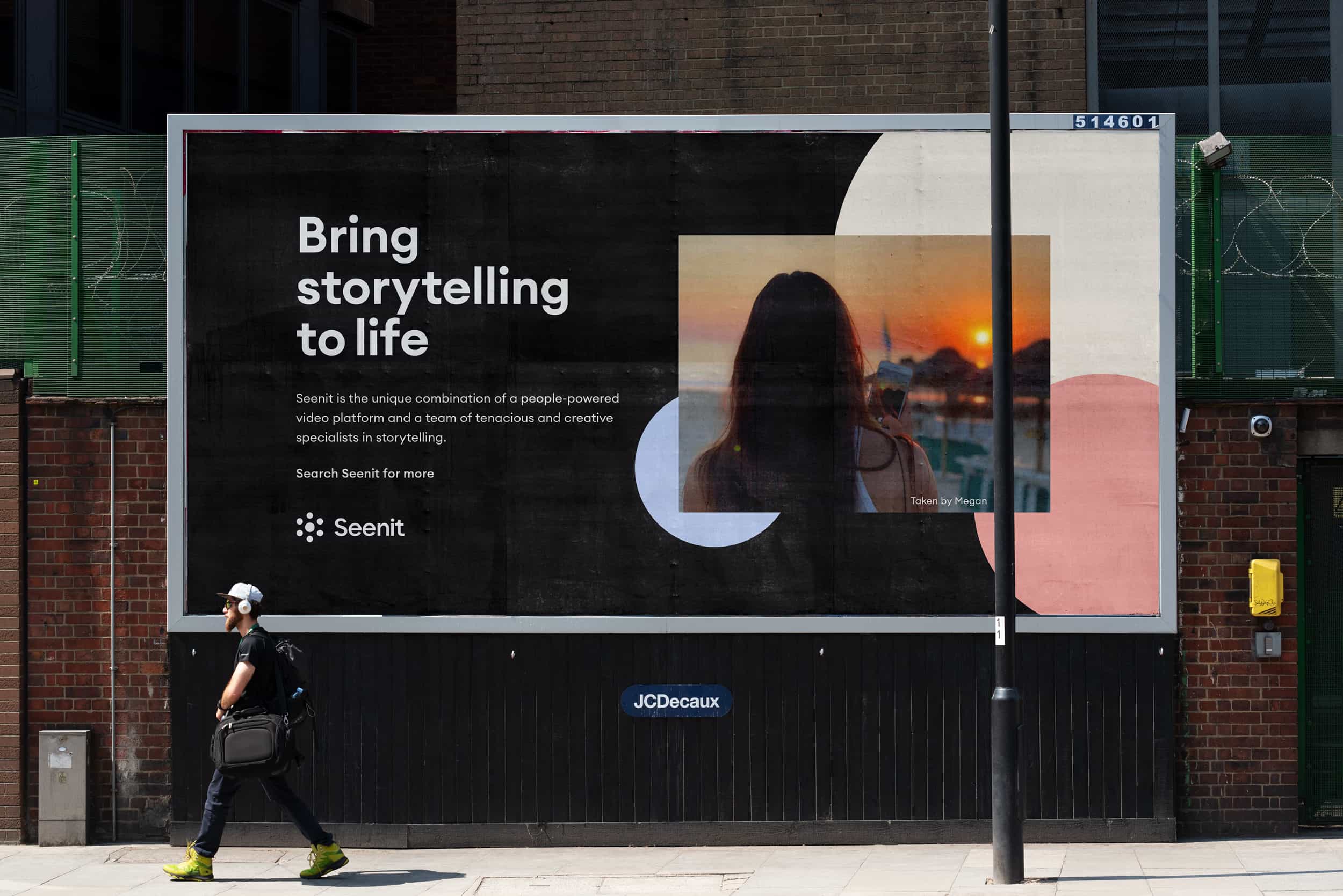
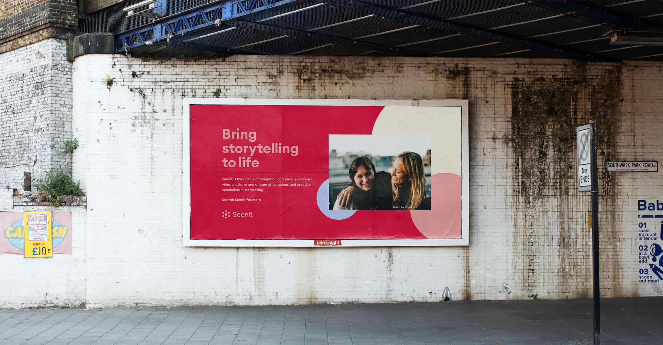
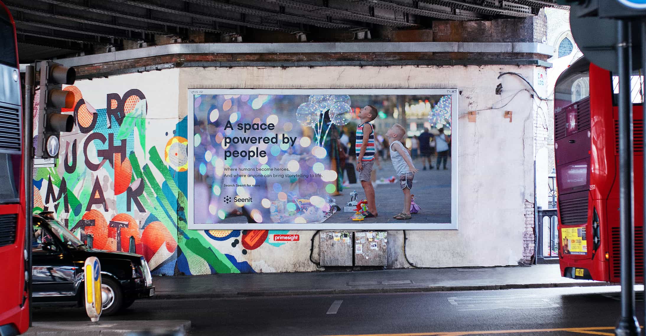
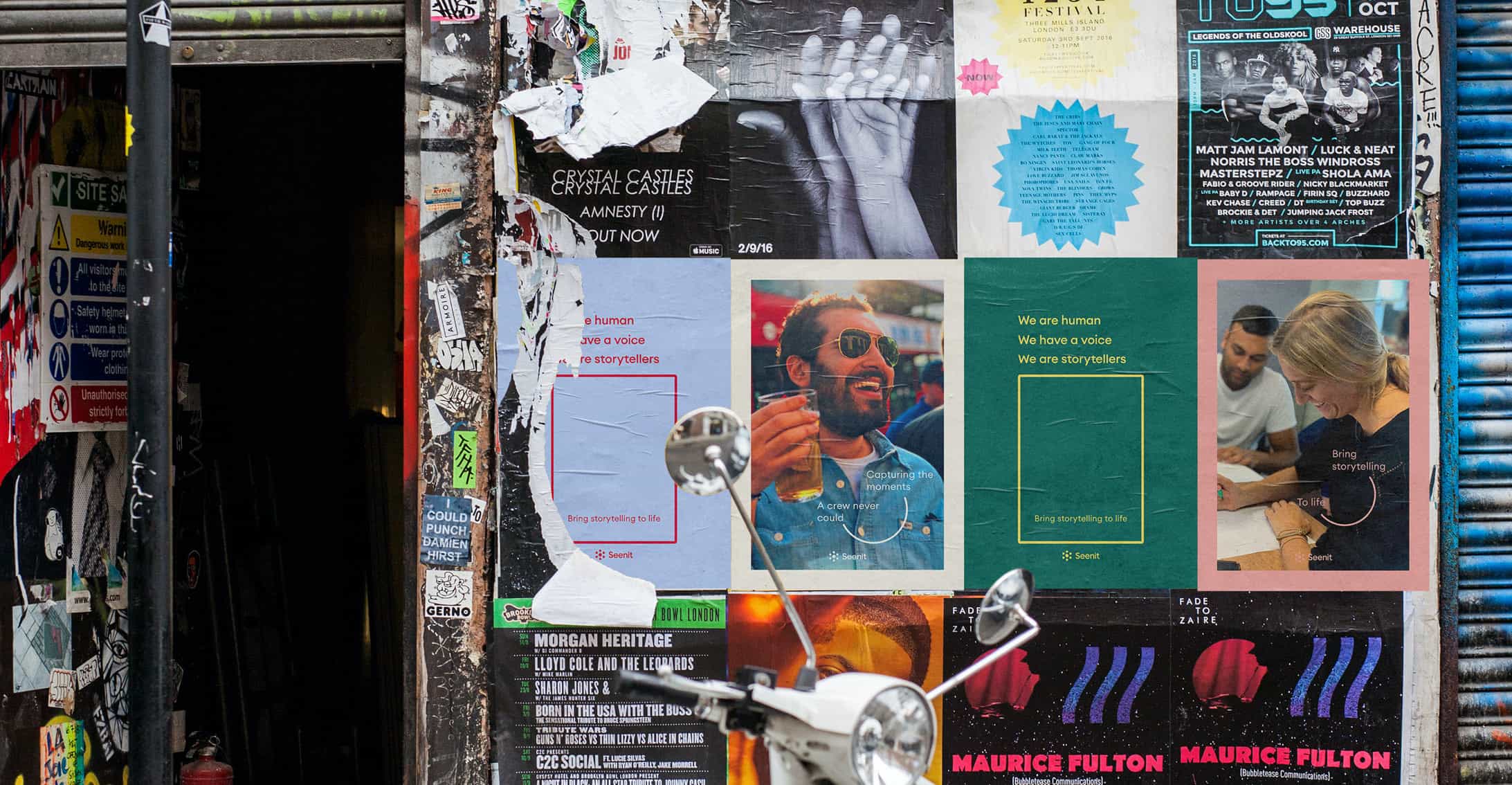
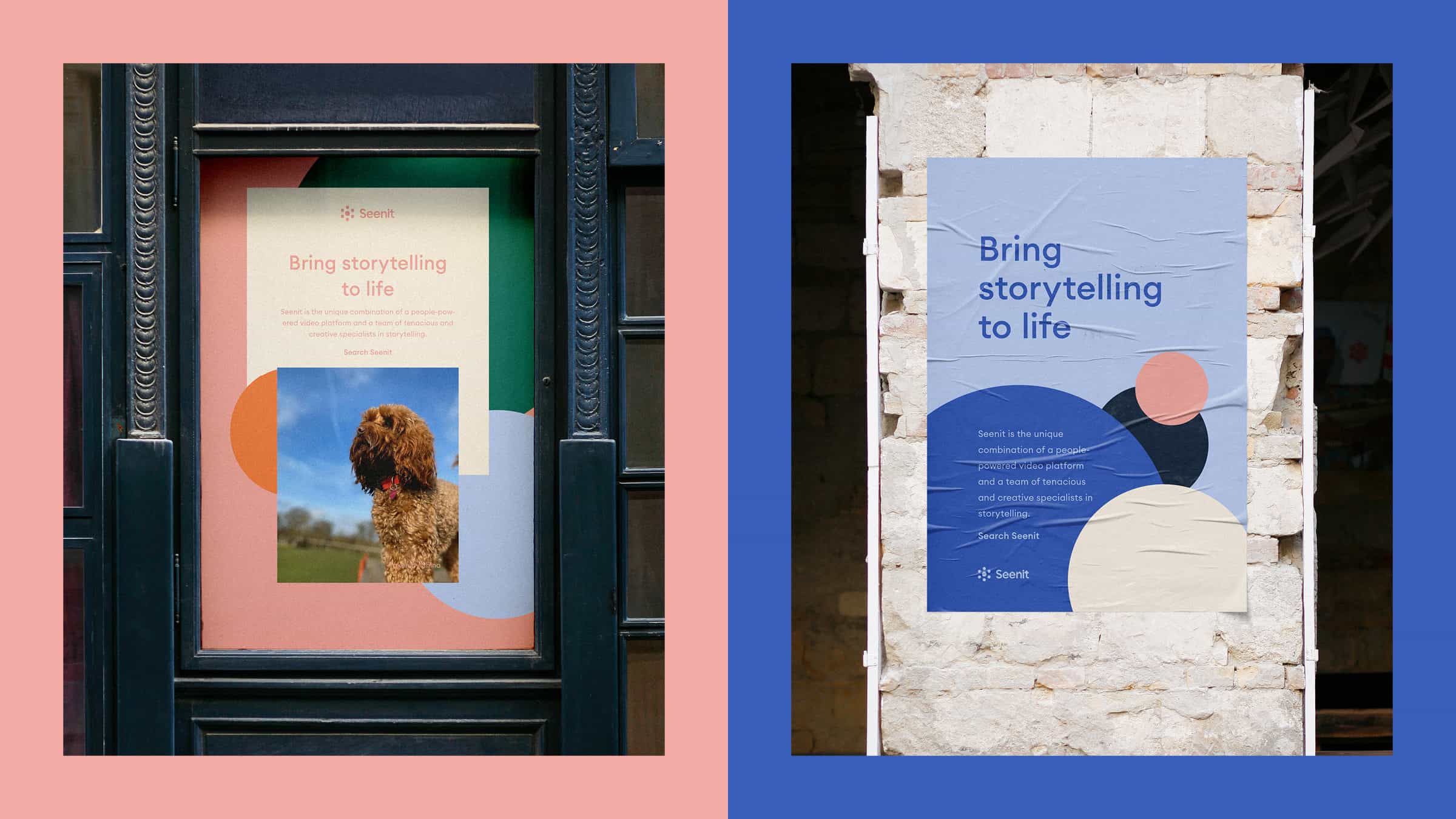
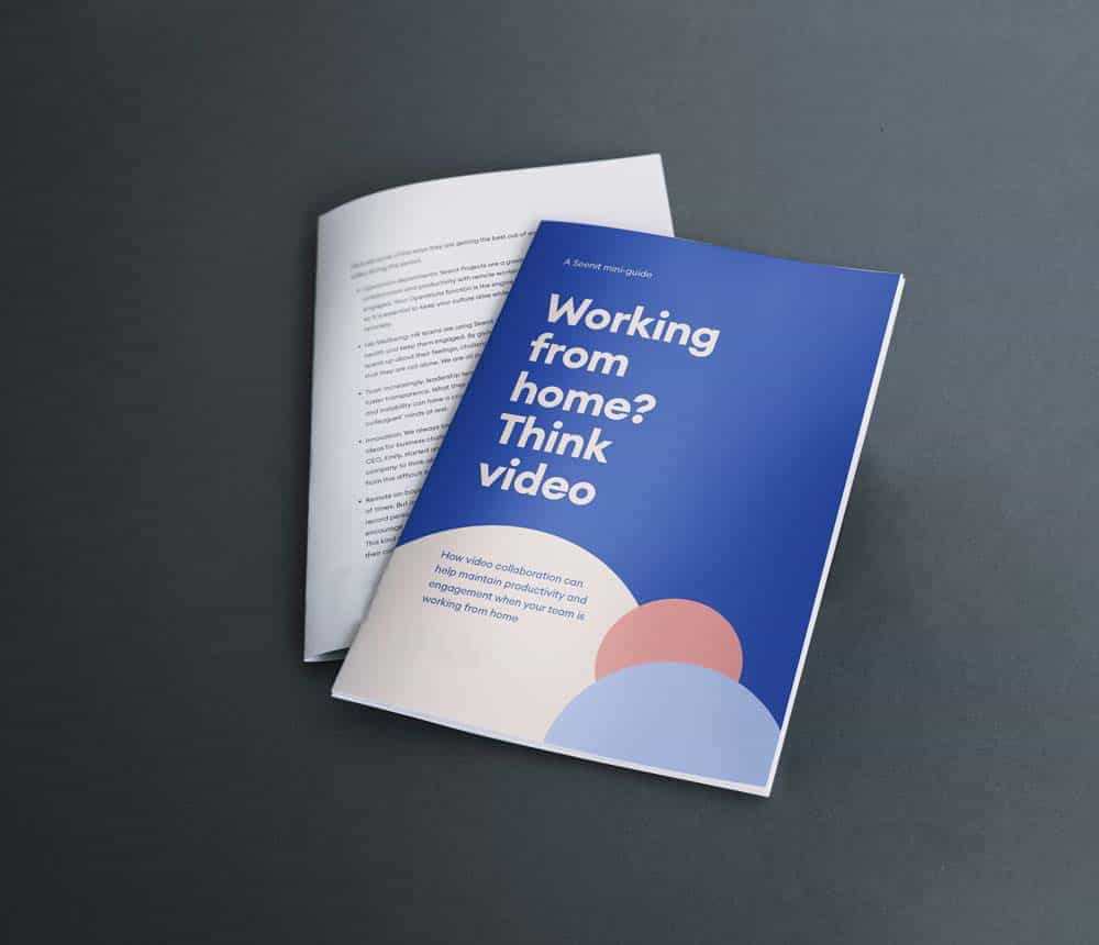
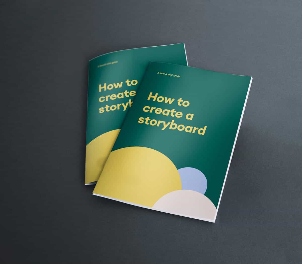
We set a launch date of early May 2020. I wanted to put together a launch video for us to run with. I used some of the messaging put together by Hodes and the logo animations to put together a simple After Effects animation that we could post out across our marketing channels to announce the new identity.
We worked with a PR agency to put together a press release and a press site that we could send out to pick up some press interest.
A rebrand can add a certain intangible value to your company. It can be hard to gauge whether the project has been a success, beyond just looking at comments, impressions, and web analytics. Here’s a few initial highlights of a project I’m personally very proud of.
Though the rebrand cannot be directly responsible for all of these results, it’s nice to look back on the project and see some impressive numbers immediately after the launch. We received huge numbers of positive comments and messages from our community, investors, and the wider team.
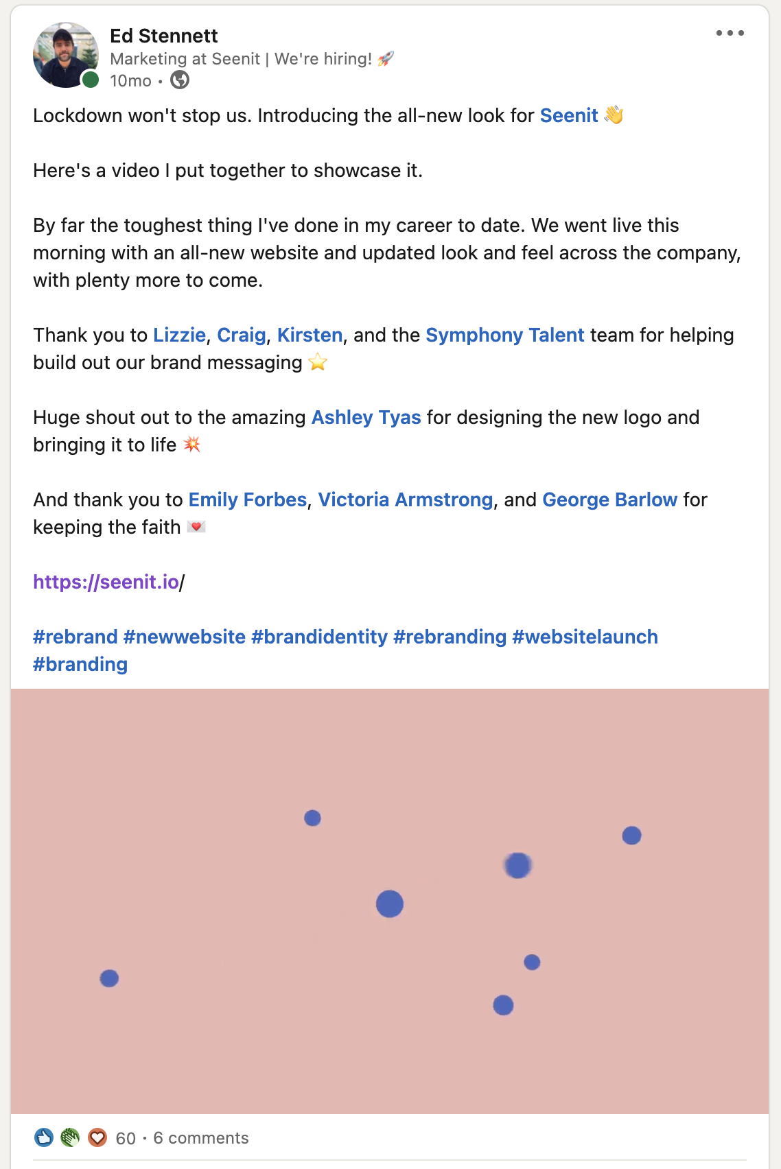
As someone that tries to post once or month or so on LinkedIn, announcing the rebrand was my most liked post to date.

As a product marketing person, I’m a big fan of ‘retro-ing’ projects. For the next rebrand project I do, here’s some of my learnings: