Ed Stennett
5 March, 2018 • 3 min read
Given the rebrand is still ongoing, I am unable to talk in too much detail about the project, but I can give an insight to the logo design process and how I used the designer’s favourite irrational number; the Golden Ratio.
The Golden Ratio has a value of ~1.61803… and it describes the perfectly symmetrical relationship between two proportions. The Golden Ratio, or Phi Φ (the 21st number of the Greek alphabet), and the Fibonacci sequence are intimately connected. Fibonacci numbers are characterised by the fact that every number after the first two is the sum of the two preceding ones:
Dividing each number by the previous number gives:
The resulting sequence is:
As the Fibonacci sequence tends towards infinity, the sum of dividing each number by the previous number tends towards Φ.
It will be these numbers that form the basis for the Logo design.
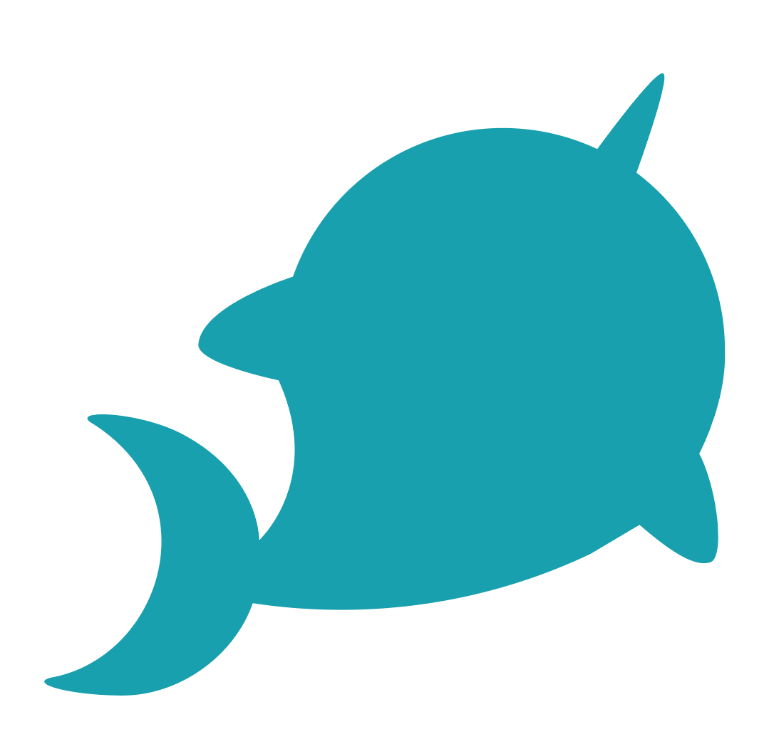
Weeks of research, video calls, meetings, workshops, and deliberation eventually led to deciding on a name; Tusk. The processes involved that enabled us to come up with the name and the whole rebrand itself are for another post, but, we had a name and the attention turned to the logo mark. We wanted to base the logo mark on a Narwhal, a medium-sized toothed whale that possesses a large “tusk” from a protruding canine tooth, as using an animal would help us build a strong and memorable identity later down the line. It was therefore over to me to begin the logo design process to create the logo mark we had already begun affectionately calling Nelly.
I began with my sketchbook, drawing various ideas for the logo mark, looking for a shape that I felt worked and would clearly define the brand. As a UI/UX designer, sketching is something that I can do, but certainly isn’t my forte, especially when it comes to graphic design. Sketching ideas for a user interface is, in my mind, very different to sketching concepts for a logo mark, especially one that involves a geometric representation of a Narwhal. However, after a few days, I had a sketch I was happy with.
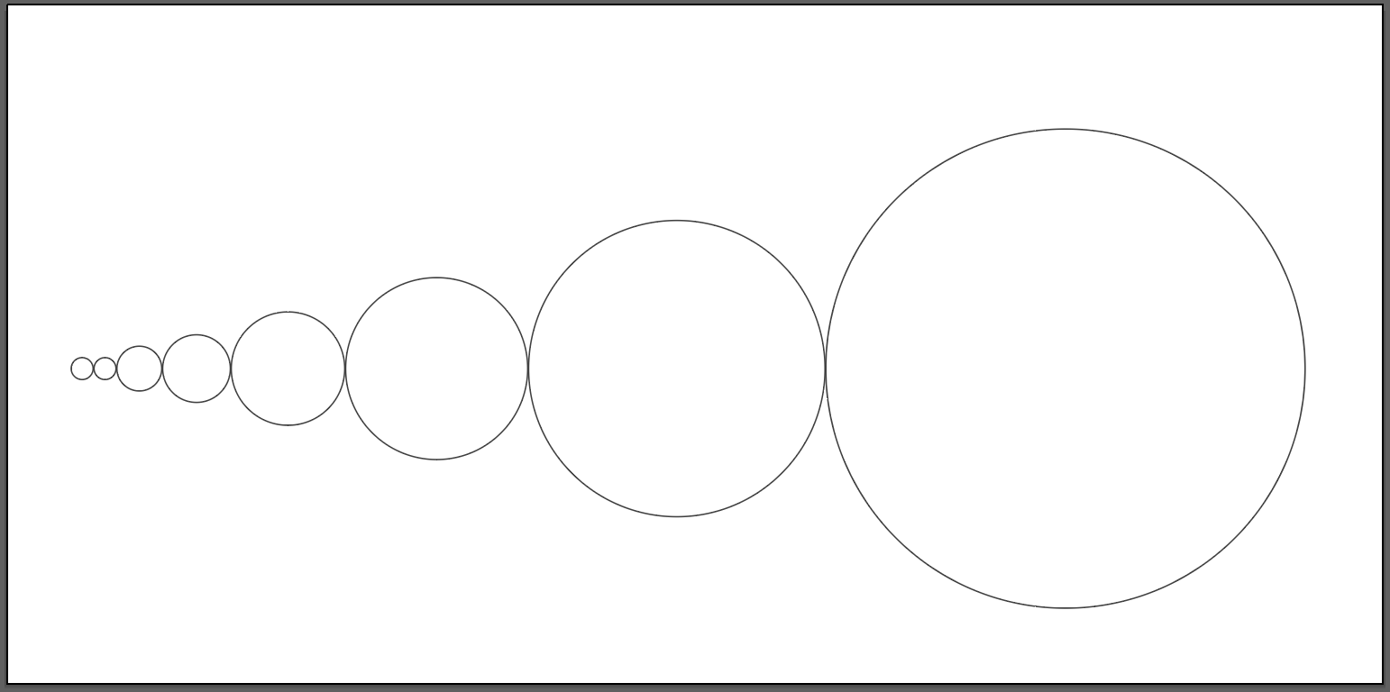
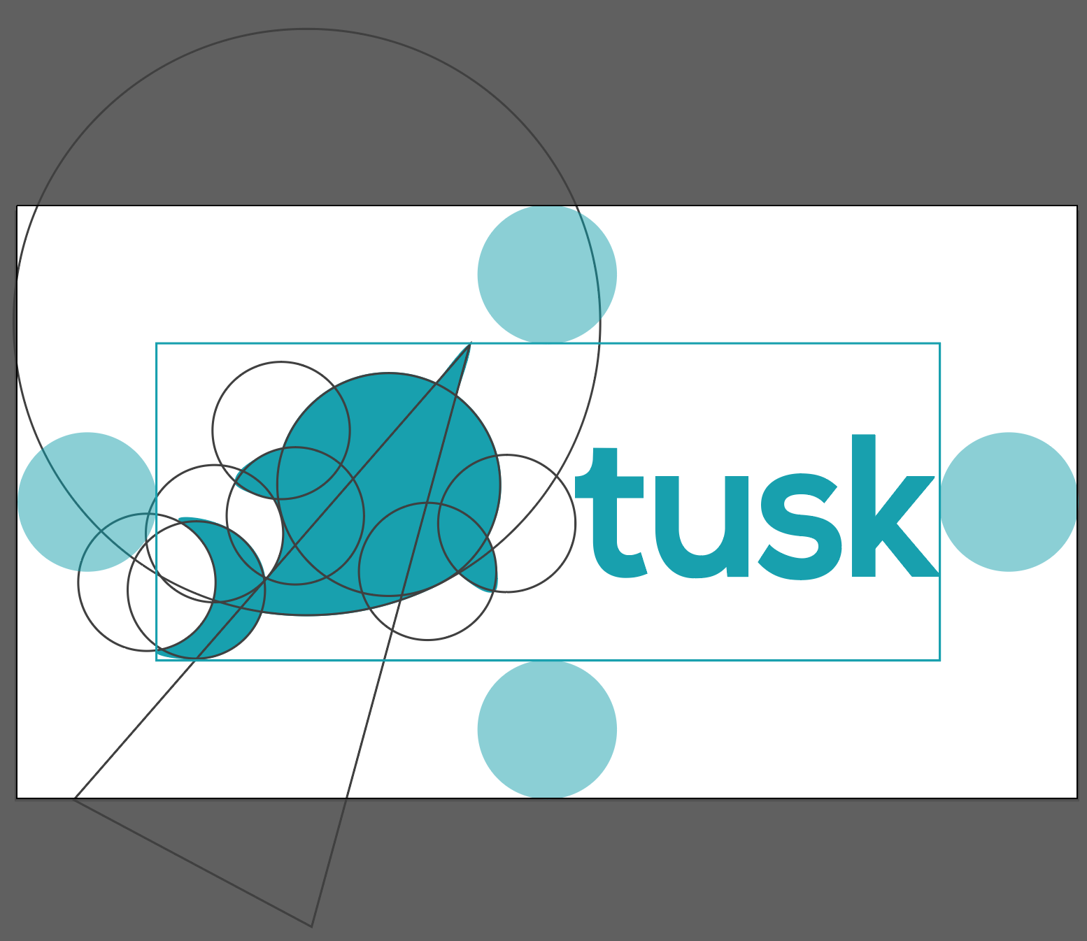
Within Illustrator, I created a series of 8 circles where the radii of each were part of the Fibonacci sequence; I would then use these circles to form the basis of the design.
Next, I began to arrange the circles in a way that seemed to fit with the original sketch. If you look closely at the image below, you might be able to make out the outline of Nelly.
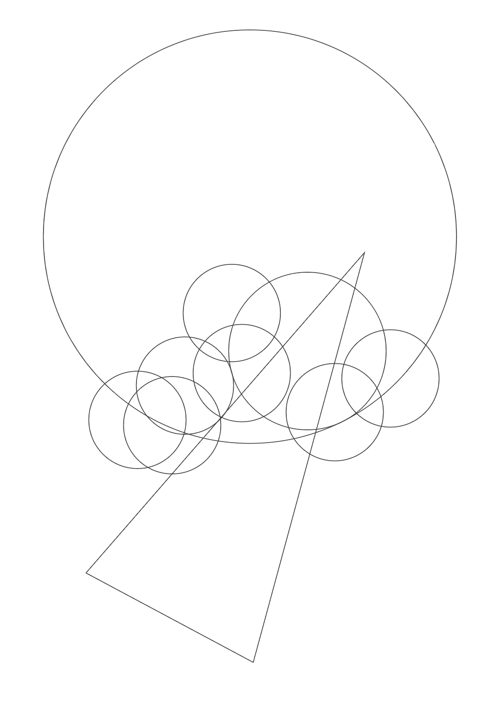
It took a bit of trial and error but I eventually had an arrangement that I was happy with. I could make use of Illustrator’s shape builder tool to create an outline.
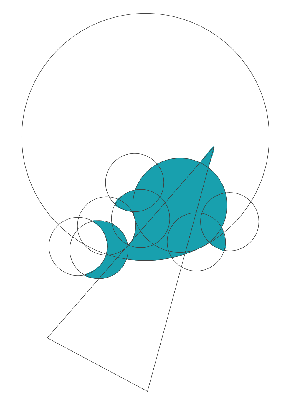
The edges were a little sharp, so I used the anchor point tool to smooth them out a bit, giving a slightly cleaner, rounder look.
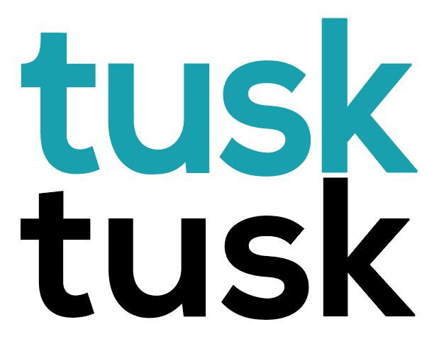
With the logo mark complete, it was time to get to work on the word mark and complete the logo. I wanted a geometric sans serif typeface to form the basis of the word mark. I used Nexa Bold, a simple but beautiful font that would form the basis of the word mark. With a bit of fiddling here and there, I got it just right. You can see the difference between the unaltered type and the final version below. Note the hook on the t, the root of the u, and the stem of the k.
Putting the two together, I arranged the logo type using the same Fibonacci circles and set a safety area. The width of the logo mark was set to 1.61 times greater than the width of the word mark, funny that?!
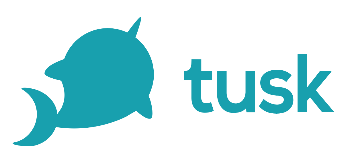
Finally, removing all the guides, we have a finished logo! Introducing Tusk.
Blog • 10 Jan 19 • 4 min read
As a Product Designer I’m used to shifting pixels, kerning letter forms, and asking users ‘what they expected when they pressed that button’. As a result, words don’t come as naturally to me as others, but I saw a video this week that I felt really captured what we are trying to say at Seenit.
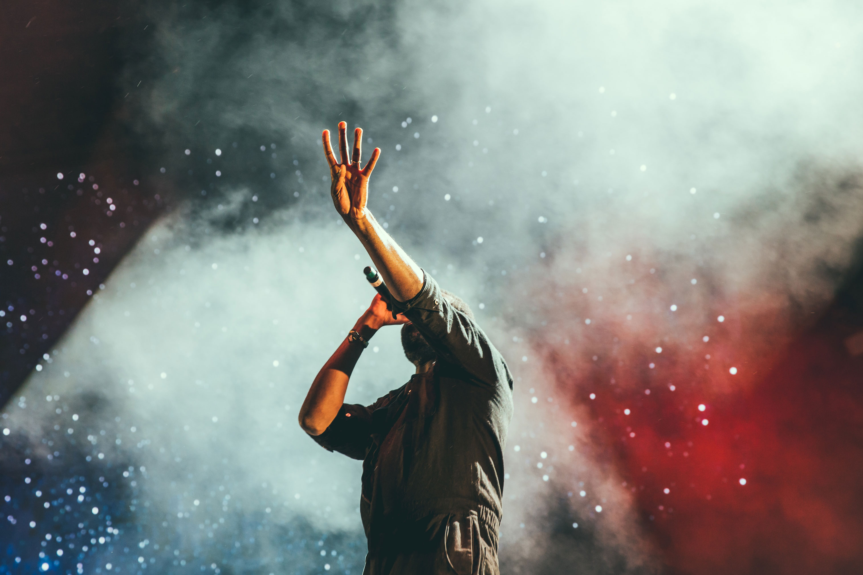
Read moreBlog • 25 Jan 19 • 3 min read
I went to the gym on a Wednesday after work. I did shoulders. I’d been going to the gym a fair bit and felt better for it. I left the gym to get into my car, still in my kit, and drive home.
Read moreBlog • 11 Mar 18 • 3 min read
There is a strong emotional connection we have with different colours, and that connection changes from person to person, and culture to culture.
Read more